3 Art Direction Tips for Productions on a Budget
In this third installment of my Art Direction series, I want to explore some simple Art Direction tips. These three techniques are worth focusing on and are relatively easy to execute even if you are in a financial bind or your entire production is pressed for time. These tips include fundamental film school techniques, but you’d be surprised how often they are missed in the frenzy and madness of pre and post production. The three concepts outlined are easy to observe and easy to execute.
So let’s dive in and talk about the 3 things I found most helpful for me when shooting “Pop-Up”. By working with your Art Director to understand these techniques, you begin to see how they can augment your captured image. As with anything done on a budget, it's more about understanding concepts, planning, and then executing to the highest standards available.
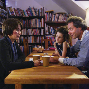
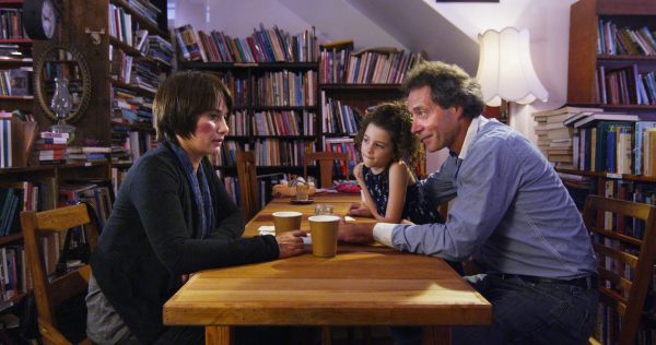 In the scene pictured above we see a struggling single father taking a stranger on a date. We wanted to create a setting that implied calm but also had an underlying tone of chaos. This 2 shot was staged in a local Newcastle cafe. Most cafes don’t generally stock shelves of books, so we deliberately created a frame with existing items that encompassed a combination of texture, warmth, and distraction. All the books were repositioned and placed in a random yet organized fashion to emote those feelings. Additional touches like the daughter’s bag, books, and toys at the end of the table, the standing lamp on the right, and the oil lamp and mirror on the left are included to finish the look.
 While on a pre-production location scout, our director found a sensational warehouse gym that had only one massive 6m x 3m frosted window, and a two-tone, rustic color scheme. This was one of my favorite locations to shoot in. The large practical light source could be used as my main key, bounce fill, but was also soft enough to shoot from various angles and not cast any noticeable shadows. This was particularly useful when using the Steadicam for orbit shots around the ring. The building’s color and texture coupled with the beam of light affecting flare and contrast looked fantastic, regardless of where I pointed the camera.
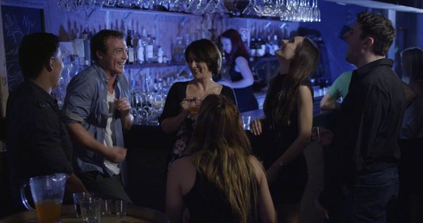 Once the talent and foreground scene was lit, I threw a cool wash in the background to mimic a neon look often found in bars. This separated the actors from the background whilst also creating a more believable and relatable environment for our audience.
A color wash can also be used to create an interesting texture when a scene is less populated or perhaps not as interesting to look at. In the example below, I used color washes yet again to create texture and mood in what would have otherwise been a rather bland studio setting. My color scheme is symbiotic with the look required by the Art Department.
 Whether you follow these three tips a little or a lot, you’ll find that paying attention to the details can make a huge difference to your final product. It takes a lot of planning and stylized set dressing in particular can vary wildly in cost. But you’ll thank yourself when you see cohesive images and storylines in your film.
*****
Read the rest of the series!
Read Part 1 here: Introduction
Read Part 2 here: What is Art Direction?
Read Part 4 here: Graphic Novel Inspiration: Frank Miller and Zack Snyder
Read Part 5 here: Lessons from a Master – John Seale, ASC ACS
Read Part 6 here: 4 Lessons from a Film Set

Take the Time to Dress Your Set
Set Dressing is something I'm very fond of. It is the simple (sometimes deceptively simple) task of populating, positioning, re-positioning, and replacing an empty or current space with objects to create coherent aesthetics and depth. This is often compromised for the sake of time to the detriment of the final product. There is more emphasis placed on camera or lens technology, and not enough on creating a believable world in the first place. Don't be afraid to ask your cast, crew, and family what items they may own and would be willing to loan. You don't need a big checkbook, just a well organized check-list! In the scene pictured above we see a struggling single father taking a stranger on a date. We wanted to create a setting that implied calm but also had an underlying tone of chaos. This 2 shot was staged in a local Newcastle cafe. Most cafes don’t generally stock shelves of books, so we deliberately created a frame with existing items that encompassed a combination of texture, warmth, and distraction. All the books were repositioned and placed in a random yet organized fashion to emote those feelings. Additional touches like the daughter’s bag, books, and toys at the end of the table, the standing lamp on the right, and the oil lamp and mirror on the left are included to finish the look.
Scout for the Right Location
We all know location shoots are mandatory in convincing indie storytelling, but it seems like many productions forget about finding a space that has the ability to multi-task. A few extra hours or days scouting locations and planning will save time on set. The still below shows a “Pop-Up” scene of a sparing fight sequence in a boxing ring. While on a pre-production location scout, our director found a sensational warehouse gym that had only one massive 6m x 3m frosted window, and a two-tone, rustic color scheme. This was one of my favorite locations to shoot in. The large practical light source could be used as my main key, bounce fill, but was also soft enough to shoot from various angles and not cast any noticeable shadows. This was particularly useful when using the Steadicam for orbit shots around the ring. The building’s color and texture coupled with the beam of light affecting flare and contrast looked fantastic, regardless of where I pointed the camera.
Use Color Washes to Your Advantage
A very useful technique I often like to employ is the use of color washes. While this could be classified as lighting, it is often a creative decision made in tandem with the Art Department to create a color palette. These days, color washing is often left up to post, but when color is effectively used on set it can have a big impact. In the bar scene in the still below, we arrived to a club that was literally a bare bones shell. Our Art Department did a fantastic job with set dressing and placed all props, glasses, and bottles to convince our audience that we were in an establishment open and trading for business. Once the talent and foreground scene was lit, I threw a cool wash in the background to mimic a neon look often found in bars. This separated the actors from the background whilst also creating a more believable and relatable environment for our audience.
A color wash can also be used to create an interesting texture when a scene is less populated or perhaps not as interesting to look at. In the example below, I used color washes yet again to create texture and mood in what would have otherwise been a rather bland studio setting. My color scheme is symbiotic with the look required by the Art Department.
 Whether you follow these three tips a little or a lot, you’ll find that paying attention to the details can make a huge difference to your final product. It takes a lot of planning and stylized set dressing in particular can vary wildly in cost. But you’ll thank yourself when you see cohesive images and storylines in your film.
*****
Read the rest of the series!
Read Part 1 here: Introduction
Read Part 2 here: What is Art Direction?
Read Part 4 here: Graphic Novel Inspiration: Frank Miller and Zack Snyder
Read Part 5 here: Lessons from a Master – John Seale, ASC ACS
Read Part 6 here: 4 Lessons from a Film Set

Leave a comment