Frank Miller & Zack Snyder: from panel to screen
I have a love affair with comic book art. There are so many parallels between comics and graphic novels, and filmmaking – particularly when it comes to Production Design and Art Direction. There is so much to inspire us as filmmakers in the art of graphics novels: from the art of storyboarding to owning a distinct color palette to having a firm grasp of lighting. These are things we all aspire to master, and luckily for us, we have a massive library of inspiration available in the graphic novel section of our local book store.
My two favorite graphic novels both came from the wonderful mind and hand of Frank Miller and were brought to the silver screen by Zack Snyder. Let’s take a look at how the original novels created a world with color and see their relationship to the films they inspired. Then let’s talk about some tools we can use to actually do this ourselves!
 While Director Christopher Nolan has said his Dark Knight Trilogy was influenced by Miller, it is arguably more clearly seen in Zack Snyder's Batman v Superman: Dawn of Justice. (Though he’s certainly taking some liberties with the plot.) It's easy to see this when you look at the costumes in particular. The batsuit worn by Ben Affleck is cloth instead of armor and the style is heavily influenced by the one seen in the third novel in the series, Hunt the Dark Knight.
The iconic lighting shot cover of the original graphic novel release is also replicated in Snyder's film.
While Director Christopher Nolan has said his Dark Knight Trilogy was influenced by Miller, it is arguably more clearly seen in Zack Snyder's Batman v Superman: Dawn of Justice. (Though he’s certainly taking some liberties with the plot.) It's easy to see this when you look at the costumes in particular. The batsuit worn by Ben Affleck is cloth instead of armor and the style is heavily influenced by the one seen in the third novel in the series, Hunt the Dark Knight.
The iconic lighting shot cover of the original graphic novel release is also replicated in Snyder's film.


The Dark Night Returns
Perhaps the most famous graphic novel (or my favorite at least), was Frank Miller’s The Dark Knight Returns, released in 1986. With IGN calling it “a true masterpiece of storytelling” and Time listing it as one of the best 10 graphic novels ever written, it is the most critically-acclaimed graphic novel of all time. The artwork is, in a word - breathtaking. Especially to me as 13-year-old boy at the time of release! The overall color palette of the novel is made up of blues and grays with bursts of vivid color applied deftly by the illustrators to create a world both vibrant and moody, terrifying and courageous. Much emphasis was placed on the world and environment. Backgrounds and foregrounds were inked with creative use of shading to illustrate depth and silhouettes, all coming together to create a cinematic look. When Superman appears in Batman’s world his red cape is a striking contrast to the world of Gotham. This immediately reminds us of his other worldliness but also pits him against our hero (or anti-hero!).
While Director Christopher Nolan has said his Dark Knight Trilogy was influenced by Miller, it is arguably more clearly seen in Zack Snyder's Batman v Superman: Dawn of Justice. (Though he’s certainly taking some liberties with the plot.) It's easy to see this when you look at the costumes in particular. The batsuit worn by Ben Affleck is cloth instead of armor and the style is heavily influenced by the one seen in the third novel in the series, Hunt the Dark Knight.
The iconic lighting shot cover of the original graphic novel release is also replicated in Snyder's film.
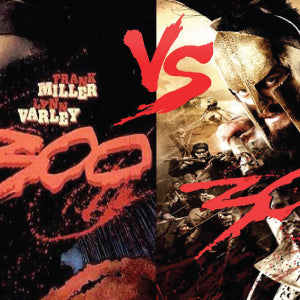
300
Another excellent graphic novel example would be Frank Miller’s series 300 published in 1998. Penciled by Miller & colored by Lynn Varley. Zack Snyders 2006 film is remarkably true to the graphic novel in color, tone, and story. Frank Miller acted as executive producer and consultant on the film and the two worked together to create a pop culture masterpiece. For this one, I think images will speak louder than words. Check out these side by side graphic novel and film shots.
OK cool. So how do I do that?!
Two easy ways to get started. 1. Adobe Capture Adobe has a terrific app called Adobe Capture. Anyone with a creative cloud account can download it, sign in, and is given access to 5 useful tools. Notably the color and looks tools are designed to create a color palette and re-create that look in post. Point your camera (cell phone, tablet camera) at a scene you’ve lit or dressed, or even one you see from a screen shot or print or just out in the world, and press capture. The app automatically captures a basic color palette which you can save in your library. This can then be uploaded, retrieved later, and applied to your clips. It also allows you to apply a dominant color to your style and adjust the intensity of the look itself. For anyone new to color palettes, I highly recommend using this tool just to get a visual understanding of how shades of color work within an environment or setting. 2. Pick up a book Get inspired! Pull out all those old comics stored in your basement. Check out some new ones at your local library or book store. Go to an art gallery. Watch more films. Get inspired and then start experimenting! ***** Read the rest of the series! Read Part 1 here: Introduction Read Part 2 here: What is Art Direction? Read part 3 here: 3 Art Direction Tips for Productions on a Budget Read Part 5 here: Lessons from a Master – John Seale, ASC ACS Read Part 6 here: 4 Lessons from a Film Set
Leave a comment