Film Lighting Basics: What's the Color of Your Movie?
This is Part 3 of a Film Lighting Basics series from Robert Machado and Jeremy Le. The series will cover Intensity, Quality, Color, Shape, and Direction.
Think of a movie that you enjoyed. What color would you use to describe it?
One of my favorite characters of all time is Batman, so Christopher Nolan’s The Dark Knight trilogy has had quite an impact on me. When someone asks me how I would describe each of those movies, I would describe them by color.
Batman Begins feels very orange, like the sodium vapor street lights of Gotham city. The Dark Knight feels cool and blue, reminiscent of the Joker’s white face paint and purple suit. The Dark Knight Rises reminds me of muted grays and sepia tones, almost like a war film. Color is one of the most powerful tools you can use to tell your story, and its emotional impact can linger with you long after the experience.
 Light sources with a lower color temperature will have more orange/yellow. Light sources with a higher color temperature will have more blue light. Just like how contrast is created with putting light and dark next to each other, color contrast is created with light sources that are opposite of each other on the color temperature scale.
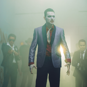
 The short film includes our portrayal of Jared Leto’s Joker in Suicide Squad and Heath Ledger’s Joker in The Dark Knight. The overhead lighting uses daylight balanced (5600K color temp.) fluorescent bulbs, so I dialed in our camera’s white balance to 4500K to keep the feel of the image cool. I chose to go with the cool/blue feel of the warehouse because I believe it helps this project feel reminiscent of The Dark Knight. The bulb’s color temperature is higher than what the camera is set to so the light will appear more blue.
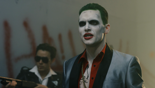
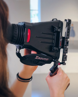
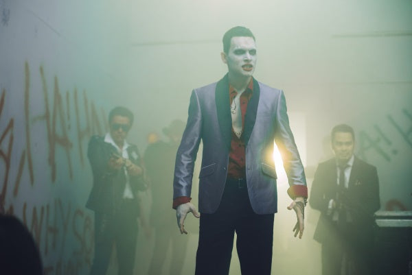 As a backlight, we were using an Arri L7-C LED fresnel. This light has the option to dial in precisely what hue and saturation you want. This means, instead of using gels, we can set it to whatever color we decide fits the scene. Even if you are not using a light fixture that has manual color controls, the principle remains the same. We chose to push the backlight towards green to emphasize the grungy, grimy feeling of the two Jokers in a cold warehouse.


Color Temperature
When you’re lighting a scene, the most common method of controlling a light’s perceived color is color temperature. Many lights nowadays are bi-color, which means they can switch between daylight (5600K) or tungsten (3200K). If you’re shooting on digital cameras, you can set your white balance to match your sources of light. If your light is tungsten balanced at 3200K and you set your camera’s white balance to 3200K, white objects will appear white. But start pushing your camera’s white balance towards daylight (5600K) and your tungsten light source will appear warmer or more orange. Mixing differently balanced light sources will create a contrast in color.
Light sources with a lower color temperature will have more orange/yellow. Light sources with a higher color temperature will have more blue light. Just like how contrast is created with putting light and dark next to each other, color contrast is created with light sources that are opposite of each other on the color temperature scale.
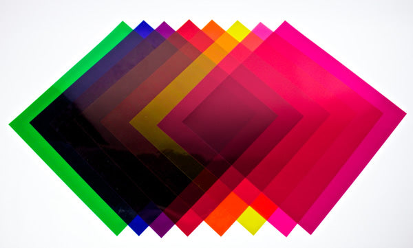
Adding Gels
The other method of controlling color is using gels in front of your light sources. There are many types of gels and many brands but some common gels that you will encounter, are CTB (color temperature blue), CTO (color temp. orange), minus green (magenta), or plus green.
The Color of my Joker
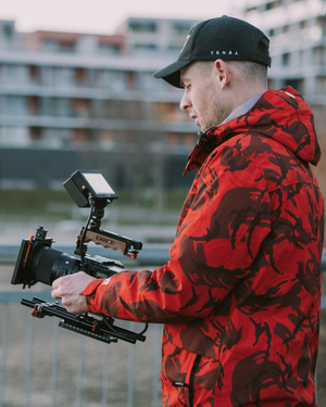
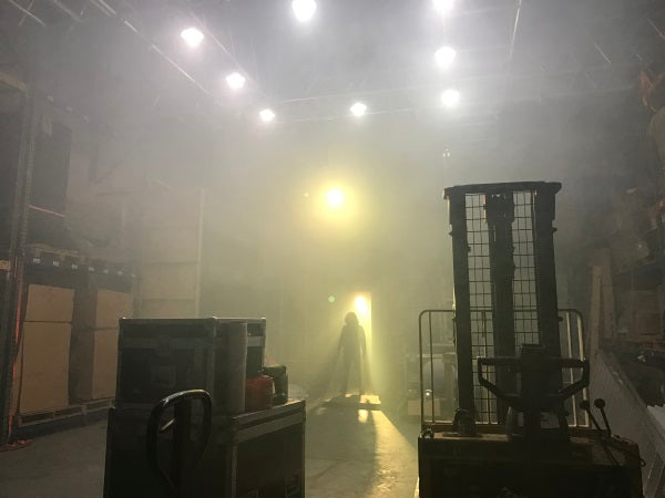
For a project I recently shot, we were in a warehouse with an overhead lighting setup. (I go into a bit more details on this set-up in the “Direction” coming out March 28th.)
The short film includes our portrayal of Jared Leto’s Joker in Suicide Squad and Heath Ledger’s Joker in The Dark Knight. The overhead lighting uses daylight balanced (5600K color temp.) fluorescent bulbs, so I dialed in our camera’s white balance to 4500K to keep the feel of the image cool. I chose to go with the cool/blue feel of the warehouse because I believe it helps this project feel reminiscent of The Dark Knight. The bulb’s color temperature is higher than what the camera is set to so the light will appear more blue.
As a backlight, we were using an Arri L7-C LED fresnel. This light has the option to dial in precisely what hue and saturation you want. This means, instead of using gels, we can set it to whatever color we decide fits the scene. Even if you are not using a light fixture that has manual color controls, the principle remains the same. We chose to push the backlight towards green to emphasize the grungy, grimy feeling of the two Jokers in a cold warehouse.
Using Incandescent Bulbs
In the middle of the warehouse location, we hung a single incandescent light bulb. The color temperature for incandescent bulbs are around 2800K, which is lower than the camera’s setting of 4500K, so it appears very warm. The hanging light bulb helps create a contrast in color compared to the overhead daylight bulbs. Understanding the color temperature scale will help you understand how to use your camera and light sources to control your image’s color. The audience’s perception of color in your project can have a huge impact on their experience of your story.In Camera vs. Grading
Even in the age of digital post production where you can get any look you want with color grading, I’m still a big fan of capturing as much of the look you want in camera. I believe this method forces you to make deliberate choices about how you want to tell your story rather than trying to decide after the fact. It gives your choices much more weight and creates a good foundation for when your project reaches post production, saving time and money. ****************************************************************************** This is the 3rd in a 5 part film lighting basics series from Robert Machado and Jeremy Le. Read Part 1 - Film Lighting Basics: The Tools you Need to Become a Master of Intensity Read Part 2 - Film Lighting Basics: Soft Lighting and Hard Lighting in Film Read Part 4 - Film Lighting Basics: 6 Ways to Shape Your Light Read Part 5 - Film Lighting Basics: Motivate Your Scene and Your Audience Through Direction
Leave a comment